Overview.
Teki is all about efficiency and comfort. They create, design and deliver premium innovative products aimed at improving quality of life. They came to us in need of a website strategy and design that would bring out the aspect of class and affordability. They make high‑performance wireless earphones and premium car chargers in the market.
Discovery
We conducted user interviews which revealed the main frustrations with the old website and helped us outline the goals that would drive the design.
We also ran card-sort followed by tree-test since we gathered from our interviews that the site was difficult to navigate. The tests helped us identify the areas of navigation that were confusing and we made tweaks before committing to the structure.
UX Strategy
Before designing or developing anything, we spent countless hours strategizing and wire-framing. We knew the website would be complex so we needed to ensure we had our planning done from the outset. This meant not only wire-framing internal pages, but planning out a detailed sign up process with different forms and fields for investors and students.
Design And Development
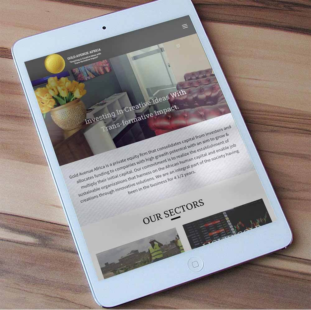
After finalizing on the strategy and wire-frames, we moved into the design and development phase. Using Gold avenue’s brand guidelines, we designed the look and the feel of the website to be consistent with the rest of Gold Avenue’s promotional materials. We also set up a 5-second test to make sure the first impression of the designs resonated with the target website visitors. Once the designs were completed, we started the development integration.
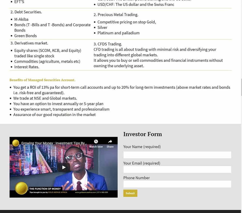
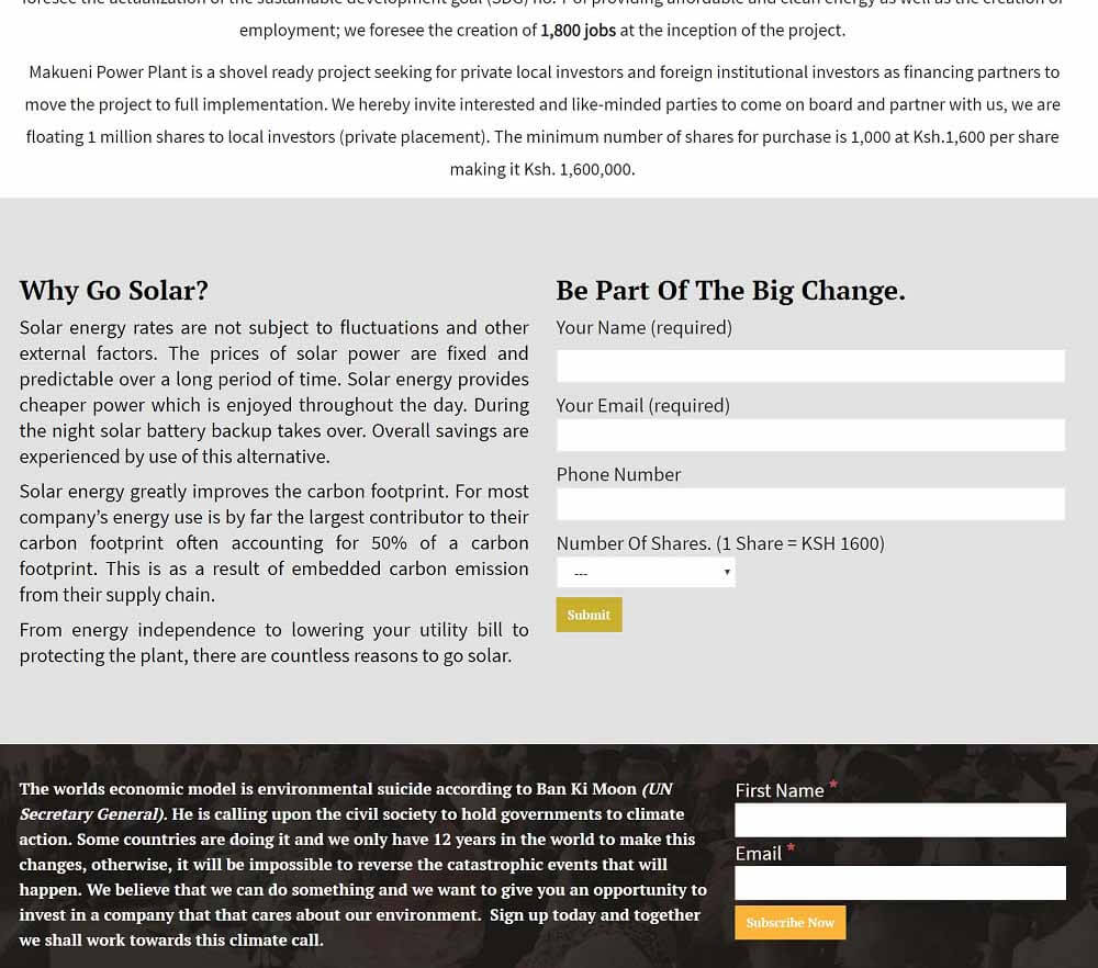
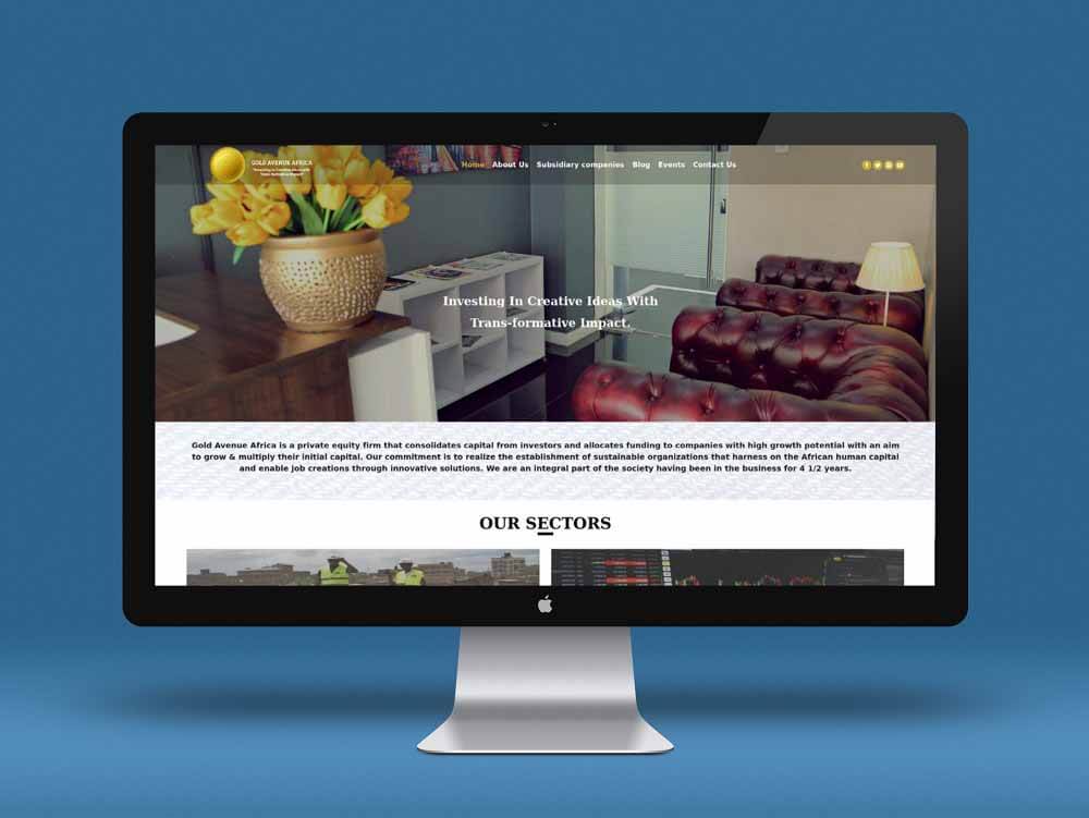
We developed the site on WordPress CMS with a Customized Theme and integrated other third-party software for email marketing, lead capture forms, analytics and CDN (Content Delivery Network) Support. The website was developed using the latest responsive technology so that visitors would have a great experience across all devices – in case they’re viewing it on a TV, desktop, laptop, tab or mobile device.
Testing, Launch And Training
We went through a rigorous testing process trying to find potential weak points where the website might break. After fixing the bugs we handed the site over to the client for their review.
During the review period, we took the time to train Gold Avenue Staff on how to manage the back-end of their website.
They had minor changes which took very little time to finalize then after evaluating the web traffic we agreed to do a night launch to ensure least amount of downtime for visitors, presenting them with a fresh new website in the morning.
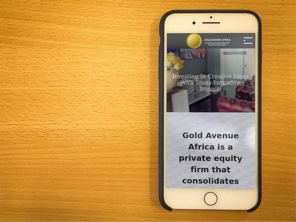
The Results
We were incredibly proud of the work we had done for Gold Avenue Africa and excited to see their completed project in action. From the concept development, wire-frames to the elegant designs and robust CMS, Gold Avenue Website has been well received by the client and visitors similarly.
Closing Thoughts
From our discovery meeting, we knew this website needed to match Gold Avenue’s level of prestige. After carefully planning, designing, and developing the website, we were able to elevate Gold Avenue’s site, allowing site visitors to easily verify Gold avenue Africa’s investment acumen and easily contact them in order to learn and invest.
Do you like what you see?
We would like to make your project awesome too!!
Hit the Contact Us button and fill the form so that we can start this conversation, but if you prefer to talk to us directly, that’s cool too.
Reach us through +254 702 322 566

